Capturing the essence of a consultancy that blends tradition and strategic growth
RMAQ needed a visual identity that reflected its mission: helping businesses overcome challenges and optimize processes. The goal was to translate that authority into a cohesive brand — one that resonated with its audience while standing out in a competitive consulting market. Market research guided the direction, ensuring every decision was rooted in what the target audience actually values.
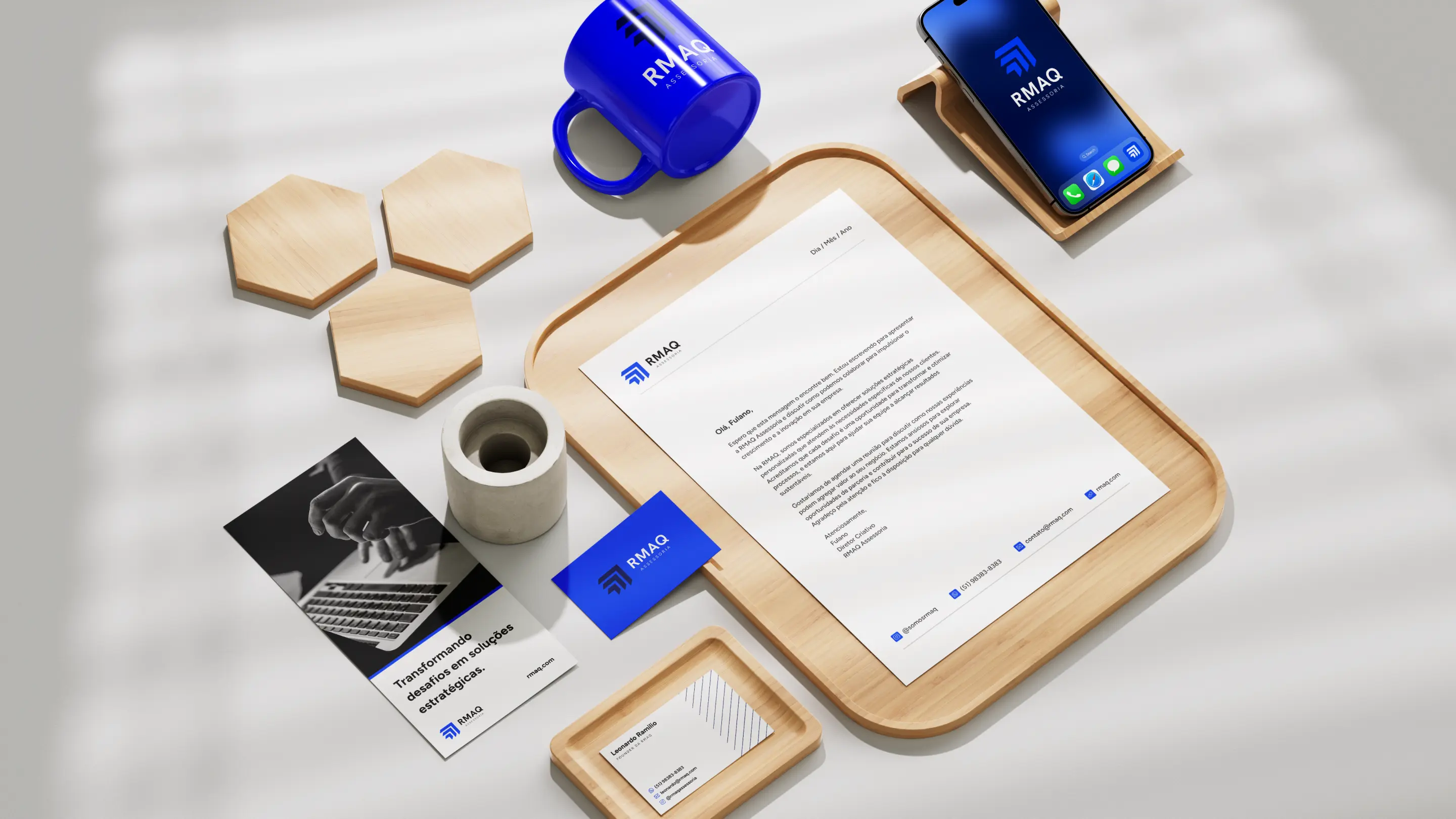
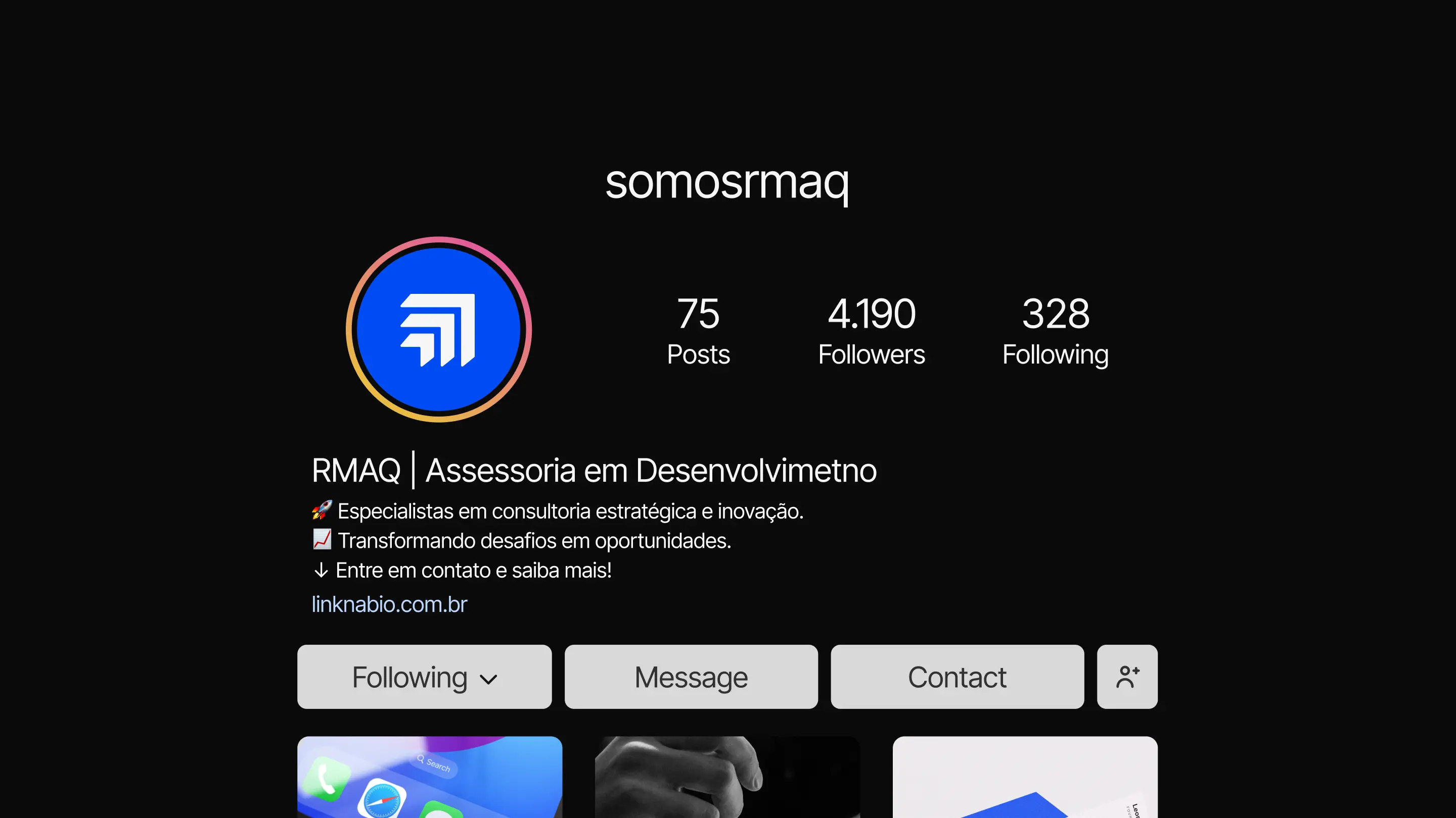
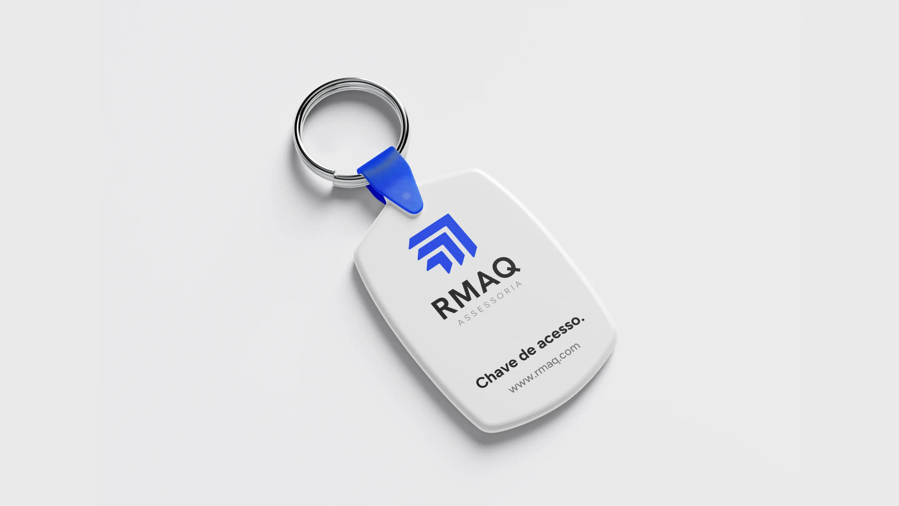
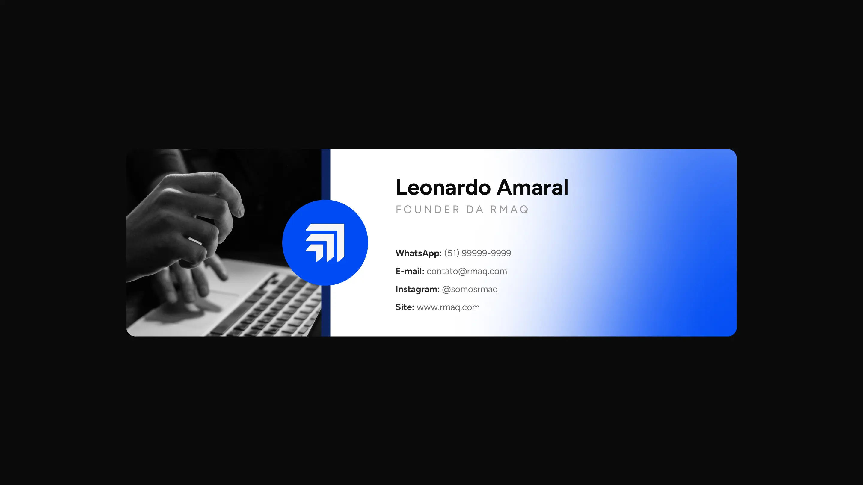
A confident, professional identity built for consistency across every platform
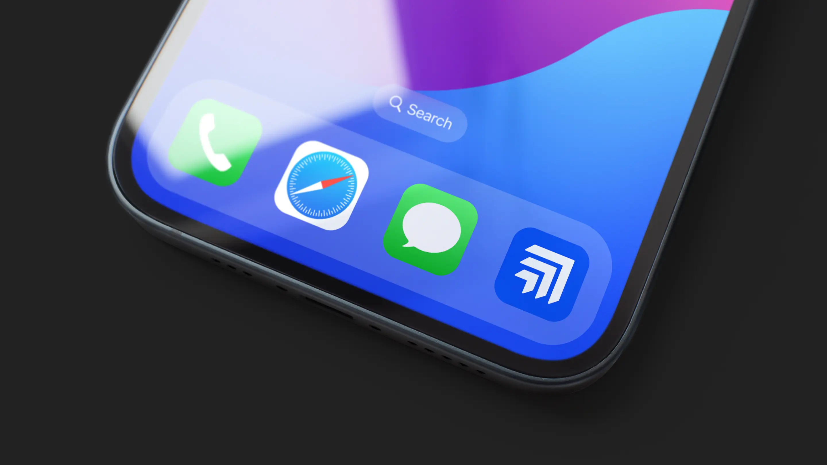
The final identity pairs modern typography with a symbol representing growth and strategy — balancing authenticity with innovation. The color palette conveys trust and professionalism, while the typographic system ensures clarity at every touchpoint. All brand applications were designed for adaptability, maintaining visual consistency whether on digital or print platforms.